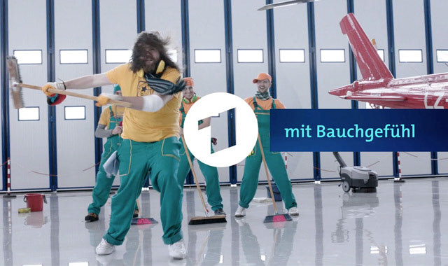
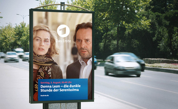
Das Erste, Redesign
Perfect Accident / Velvet Mediendesign
Creative Direction
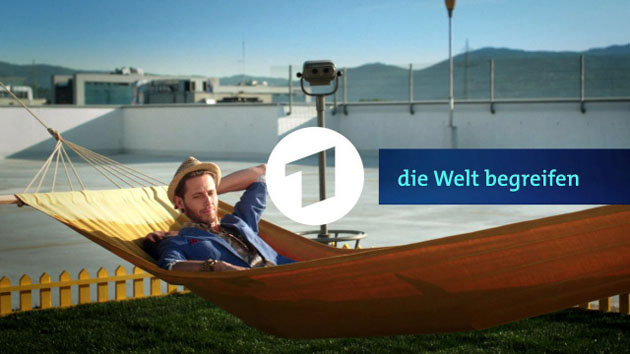
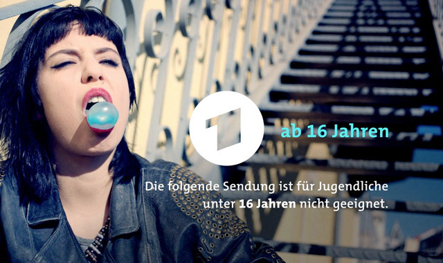
Make it more direct, clear, and simple. Distinguish Das Erste from ARD while maintaining its connection.
The “1” in the circle becomes the core element—strengthening the brand and shifting from wave to impulse.
A touch-button aesthetic signals a modern, open, and interactive identity.
Result:
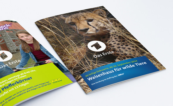
A sharper, more distinctive design, optimized for digital use.
AWARDS
German Design Award Nominee 2016 | Das Erste Rebrand | 2016